Category: Statistical Analysis

Don’t just move the average, understand the spread
Picture the scene; someone in your organisation comes up with a cost-saving idea. If we move the process mean to the lower limit, we can save £’000’s and still be in specification. The technical team doesn’t like it, but they can’t come up with a reason other than “it’ll cause problems”, the finance director loves the idea, and the production manager with one eye on costs says, well if we can save money and be in spec, what’s the problem?
Let me help you.
In this scenario, the technical team may be right. If we assume that your process is in control and produces items with a normal distribution (remember that is the best case scenario!) logic dictates that half of your data is below the average value and half is above. That being the case, what you really want to know is how far from the average the distribution spreads. If the spread is large and you change process to the extreme where the average value sits right on the customer specification limit, half of everything you make will be out of spec. Can you afford a 50% failure rate? What will the impact be on your customers, your reputation, your workload (dealing with complaints).
To work out how much we can move the process, we must first understand how much it varies, and we use a statistical value called the standard deviation to help us. Standard deviation is the average variation from the mean for a sample data set. To work it out, take 20 samples, measure them all 5 times then use a spreadsheet to work out the mean and standard deviation. If that is too much take 10 samples and measure 3 times. Keep in mind that the smaller sample size will give a larger standard deviation. Now take the mean and add 3 x standard deviation. This is the upper limit of your process spread. Subtract 3 x the standard deviation from the process mean to find the lower limit of your process spread. The difference between these two numbers is the spread of your process and will contain 99.7% of the results measured from the process output IF the process is in control and nothing changes.
If moving the mean takes the 3 standard deviation limits of your process outside of the specification, you will get complaints. It could be that the limits are already outside of the specification, in which case moving the average will make a bad situation worse.
It is possible to calculate the proportion of failures likely from a change of average, this done using z-score calculation. I’m not aiming to teach maths, so the important message is that the failure rate can be calculated.
This is the tip of the iceberg with understanding your process. If you don’t know that your process is stable and in control, the spread won’t help you because the process can jump erratically. To improve your process
1. Gain control, make sure the process is stable.
2. Eliminate errors and waste
3. Reduce variation
4. Monitor the process to make sure it stays that way.
The most significant and profitable gains are often from process stability, not from cost-cutting. All cost-cutting does is reduce the pain, think of cost-cutting as a painkiller when you have an infection. It makes it hurt less, but doesn’t stop the infection. You need to stop the infection to feel better.
Now do you want to hurt less or do you want to get better?
Why does variation and the type of variation matter?
Everything varies. We know it happens, and if you can’t see it, the variation may not be that significant to your process. However, it may be that your measurement systems are incapable of detecting significant variation that is important to your process, more about that in another post. Variation leads to production problems, waste and ultimately quality and delivery problems. Control the variation, you control the waste and costs. If waste and costs are a problem in your business, you may be interested in reading on.
There are two types of variation, common cause and special cause. Common cause variation is natural, characteristic of the process and most importantly, predictable. Special cause variation is caused by external factors acting on the process and is not predictable. This is an important distinction because the methodologies for investigating special and common cause variation are different, and if you investigate the wrong sort of variation it can waste a huge amount of time and cause frustration.
Take the process shown above. Just creating a graph of the data isn’t really useful, since it is unclear what should be investigated, or how to proceed. Typically a manager will look at a trend line to see if the process data is trending up or down. If the process is in control and (often) a manager observes an undesirable deviation from target, it is common to ask for that to be investigated. If the investigation focuses on special cause variation which is likely, since the investigator is likely to assume something is “wrong” therefore there must be a root cause. In businesses that do not use process control charts, there is no objective assessment of process performance before launching into seeking the root cause. The problem this creates is that there may not be a root cause. If common cause variation is at work, it is a fruitless exercise.
Where a root cause analysis finds nothing, managers can assume that the investigation is flawed and demand more work to identify the root cause. At this point willing workers are perplexed, nothing they look at can explain what they have seen. Eventually, the pressure leads to the willing worker picking the most likely “cause” and ascribing the failure to this cause. Success! The manager is happy and “corrective action” is taken. The problem is that system tampering will increase the variability in the system, making failures more likely.
The danger is then clear, if we investigate common cause variation using special cause techniques, we can increase variation through system tampering.
What then of the reverse, chasing common cause corrections for special cause variation. The basic performance of the process is unlikely to change, and every time there is a perceived “breakthrough” in performance, as soon as the special cause happens again the process exhibits more variation. The process does not see an increase in variation however, neither is there any improvement in the variation.
The only way to determine if the process is in control, or if a significant process change has occurred is to look at the data in a control chart. Using a control chart we can see which variation should be investigated as a special cause, and where we should seek variation reduction. In this example, the only result that should be investigated is result 8. This is a special cause and will have a specific reason. Eliminate the root cause of that and the process is in normal control. Everything else appears to be in control. Analysing the process data in this way leads to a focused investigation. If after removal of the special cause the process limits are inconsistent with the customer specification, variation reduction efforts should focus on common cause variation.
Why does the type of variation matter?
Everything varies. We know it happens, and if you can’t see it, the variation may not be that significant to your process. However, it may be that your measurement systems are incapable of detecting significant variation that is important to your process, more
There are two types of variation, common cause and special cause. Common cause variation is natural, characteristic of the process and most importantly, predictable. Special cause variation is caused by external factors acting on the process and is not predicable. This is an important distinction, because the methodologies for investigating special and common cause variation are different, and if you investigate the wrong sort of variation it can waste a huge amount of time and cause frustration.

Take the process shown above. Just creating a graph of the data isn’t really useful, since it is unclear what should be investigated, or how to proceed. Typically a manager will look at a trend line to see if the process data is
Where a root cause analysis finds nothing, managers can assume that the investigation is flawed and demand more work to identify the root cause. At this point willing workers are perplexed, nothing they look at can explain what they have seen. Eventually, the pressure leads to the willing worker picking the most likely “cause” and ascribing the failure to this cause. Success! The manager is happy and “corrective action” is taken. The problem is that system tampering will increase the variability in the system, making failures more likely.
The danger is then clear, if we investigate common cause variation using special cause techniques, we can increase variation through system tampering.
What then of the reverse, chasing common cause corrections for special cause variation. The basic performance of the process is unlikely to change, and every time there is a perceived “breakthrough” in performance, as soon as the special cause happens again the process exhibits more variation. The process does not see an increase in variation, however neither is there any improvement in the variation.

The only way to determine if the process is in control, or if a significant process change has occurred is to look at the data in a control chart. Using a control chart we can see which variation should be investigated as a special cause, and where we should seek variation reduction. In this example, the only result that should be investigated is result 8. This is a special cause and will have a specific reason. Eliminate the root cause of that and the process is in normal control. Everything else appears to be in control. Analysing the process data in this way leads to a focused investigation. If after removal of the special cause the process limits are inconsistent with the customer specification, variation reduction efforts should focus on common cause variation.
If you are interested in understanding more about variation and how it affects your process, please get in touch or visit me on stand C23 at the E3 Business Expo on 3rd April. Details can be found at https://www.1eventsmedia.co.uk/e3businessexpo/blog/2019/01/13/visitor-registrations-now-open-for-e3-business-expo-2019/
Where is the evidence for sigma shift?
This is a longer post than normal, since the topic is one that is debated and discussed wherever six sigma interacts with Lean and industrial engineering.
In lean six sigma and six sigma methodology there is a controversial little mechanism called sigma shift. Ask anyone who has been trained and they will tell you that all sigma ratings are given as short-term sigma ratings and that if you are using long term data you must add 1.5 to the sigma rating to get a true reflection of the process effectiveness. Ask where this 1.5 sigma shift comes from and you will be told with varying degrees of certainty that is has been evidenced by Motorola and industry in general. So should we just accept this?
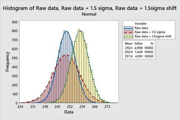
The argument is presented as a shift in the mean by up to 1.5 sigma as shown below.

Isn’t it strange in a discipline that is so exacting for evidence in so many aspects, this idea that the process sigma value must increase by 1.5 if you are using long term data is accepted without empirical evidence? The argument that Motorola or some other corporation has observed it, so it must be true sounds a lot like ‘We’ve always done it that way’. Suddenly this assertion doesn’t feel so comfortable does it? I set out to track down the source of this 1.5 sigma shift and find the source of the data, some study with actual data to prove the theory.
As soon as one starts to ask for data and search for studies, it becomes apparent that the data is not readily available to support this statement. Every paper referring to the 1.5 sigma shift seems to refer to it as ‘previous work’. Several studies came up consistently during my search.
- An article on tolerancing from 1962 by A. Bender (Bender, 1962)
- An article on statistical tolerancing by David Evans (Evans, 1975)
- An article on Six Sigma in Quality Progress from 1993 (McFadden, 1993)
- A treatise on the source of 1.5 sigma shift by Davis R. Bothe (Bothe, 2002)
So why am I focusing on these 4 citations? I perceive a migration across these papers from a simplified method of calculating cumulative tolerances to a theoretical explanation of where the 1.5 sigma shift comes from.
The first article in this series was written in 1962. At this time all calculations were done by hand, complex calculations with the aid of a slide rule. Mistakes were easy to make, and the process was time consuming. This was before electronic calculators, and before computers. Bender was seeking a shortcut to reduce the time taken to calculate tolerance stacks, whilst retaining some scientific basis for their calculation. The proposed solution was to use a fudge factor to arrive at a perceived practical tolerance limit. The fudge was to multiply the variance by 1.5, a figure based on “probability, approximation, and experience”. There is nothing wrong with this approach, however it cannot be called a data driven basis. It should also be understood that the purpose of the 1.5 sigma shift in this case was to provide a window for tolerancing that would give an acceptable engineering tolerance for manufactured parts.
The paper by Evans then provides a critical review of the methods available and uses the Bender example as a low technology method for setting tolerances that appears to work in that situation. One interesting comment in Evans paper is in his closing remarks
“Basic to tolerancing, as we have looked at it here as a science, is the need to have a well-defined, sufficiently accurate relationship between the values of the components and the response of the mechanism.”
Is there evidence that the relationship between the values of the components and the response of the mechanism is sufficiently well defined to use it as a basis for generalisation of tolerancing? I would argue that in most processes this is not the case. Commercial and manufacturing functions are eager to get an acceptable product to market, which is in most cases the correct response to market need. What most businesses fail to do thereafter is invest time, money and effort into understanding these causal relationships, until there is a problem. Once there is a problem, there is an expectation of instant understanding. In his concluding remarks Evans also notes that
“As for the other area discussed, the shifting and drifting of component distributions, there does not exist a good enough theory to provide practical answers in a sufficiently general manner.”
It seems then, that as of 1975 there was inadequate evidence to support the notion of 1.5 sigma shift.
The next paper identified, is an article by McFadden published in Quality Progress in 1993. In this article, MCfadden makes a strong mathematical case that when tolerancing, aiming for a Cp of 2 and Cpk of 1.5 yields a robust process. This is based upon a predicted shift in the process mean of 1.5σ. Under these circumstances, a defect rate of 3.4 defects per million opportunities would be achieved. Again, a sound mathematical analysis of a theoretical change, however there remains no evidence that it is real. Reference is made here to the paper by Bender.
The paper by Bothe, is very similar to the one by McFadden. Both papers express a view that there is evidence for this process shift somewhere, usually with Motorola sources quoted. The articles by Evans, McFadden, and Bothe are all referring to the case where the process mean shifts by up to 1.5 σ with no change in the standard deviation itself. Evans notes that there is no evidence this is a true case.
If you keep searching eventually you find an explanation of the source of 1.5 sigma shift from the author of Six Sigma itself, Mikel J. Harry. Harry addressed the issue of 1.5σ shift in his book Resolving the Mysteries of Six Sigma (Harry, 2003). On page 28 there is the most compelling evidence I have found for the origin of the 1.5σ shift. Harry states in his footnote
“Many practitioners that are fairly new to six sigma work are often erroneously informed that the proverbial “1.5σ shift factor” is a comprehensive empirical correction that should somehow be overlaid on active processes for purposes of “real time” capability reporting. In other words, some unjustifiably believe that the measurement of long-term performance is fully unwarranted (as it could be algebraically established). Although the “typical” shift factor will frequently tend toward 1.5σ (over the many heterogeneous CTQ’s within a relatively complex product or service), each CTQ will retain its ow unique magnitude of dynamic variance expansion (expressed in the form of an equivalent mean offset.”
This statement confirms that there is no comprehensive empirical evidence for the 1.5σ shift. Furthermore, Harry clearly states that the long-term behaviour of a process can only be established through long term study of that process. A perfectly reasonable assertion. There is another change here, in that Harry explains the 1.5 σ shift in terms of an increase in the standard deviation due to long term sampling variations, not as is often postulated in other texts, movements in the sample mean. Harry’s explanation is consistent with one of the central precepts of six sigma, namely that the sampling regime is representative. If the regime is representative, it is clear that the sample mean can vary only within the confidence interval associated with the sample. Any deviation beyond this would constitute a special cause since the process mean will have shifted, yielding a different process. The impact of different samples will be to yield an inflated standard deviation, not a shift of mean. This means that the 1.5sigma shift should be represented as below, not as a shift of the mean
In his book Harry expands on the six sigma methodology as a mechanism for setting tolerances and examining the capability of a process to meet those tolerances with a high degree of reproducibility in the long term. Much of the discussion in this section relates to setting of tolerances using a safety margin M=0.50 for setting of design tolerances.
It seems the 1.5σ shift is a best guess estimation of the long-term tolerances required to ensure compliance with specification. It is not, and never has been a profound evidence-based relationship between long term and short-term data sets. The source of this statement is none other than Mikel J. Harry, stated in his book and reproduced above. Harry has stated that
“…those of us at Motorola involved in the initial formulation of six sigma (1984 – 1985) decided to adopt and support the idea of a ‘1.5σ equivalent mean shift’ as a simplistic (but effective) way to account for the underlying influence of long-term, random sampling error.”
For me it is a significant coincidence that Bender proposed an estimating formula for tolerancing of processes based on 1.5 * √variance of x. Variance is a statistical term. It is defined as follows

The square root of variance is the standard deviation. Or put another way, we can estimate the likely behaviour over time of a process parameter using 1.5 sigma as the basis of variation to allow for shifts and drifts in the sampling of the process.
Given the dynamic nature of processes and process set-up, the methodology employed in process setting can greatly influence the observed result. For example if the process set up instruction requires the process to be inside specification before committing the run, then there may be genuine differences in the process mean. This will be far less likely if the process setup instruction requires the process to be on target with minimum variance.
It seems to me that the 1.5 sigma shift is a ‘Benderized tolerance’ based on ‘probability, approximation, and experience’. If tolerances are set on this basis, it is vital that the practitioner has knowledge and experience appropriate to justify and validate their assertion.

Harry refers to Bender’s research, citing this paper as a scientific basis for non-random shifts and drifts. The basis of Bender’s adjustment must be remembered – ‘probability, approximation and experience’. Two of these can be quantified and measured, what is unclear is how much of the adjustment is based on the nebulous parameter of experience.
In conclusion, it is clear that the 1.5 sigma shift quoted in almost every six sigma and lean six sigma course as a reliable estimate of long term shift and drift of a process is at best a reasonable guess based on a process safety margin of 0.50. Harry has stated in footnote 1 of his book
“While serving at Motorola, this author was kindly asked by Mr Robert ‘Bob’ Galvin not to publish the underlying theoretical constructs associated with the shift factor, as such ‘mystery’ helped to keep the idea of six sigma alive. He explained that such a mystery would ‘keep people talking about six-sigma in the many hallways of our company’.”
Given this information, I will continue to recommend that if a process improvement practitioner wishes to make design tolerance predictions then a 1.5 sigma shift is as good an estimate as any and at least has some basis in the process. However, if you want to know what the long-term process capability will be and how it compares to the short-term process capability, continue to collect data and analyse when you have both long and short term data. Otherwise, focus on process control, investigating and eliminating sources of special cause variation.
None of us can change where or how we are trained, nor can we be blamed for reasonably believing that which is presented as fact. The deliberate withholding of critical information to create mystery and debate demonstrates a key difference in the roots of six sigma compared to lean. Such disinformation does not respect the individual and promotes a clear delineation between the statisticians and scientists trained to understand the statistical basis of the data, and those chosen to implement the methodology. This deliberate act of those with knowledge withholding information, has created a fundamental misunderstanding of the methodology. Is it then any wonder that those who have worked diligently to learn, having been misinformed by the originators of the technique now propagate and defend this misinformation?
What does this mean for the much vaunted 3.4 DPMO for six sigma processes?
The argument for this level of defects is mathematically correct, however the validity of the value is brought into question when the objective evidence supporting the calculation is based in supposition not process data. I think it is an interesting mathematical calculation, but if you want to know how well your process meets the specification limits, the process capability indices Cp and Cpk are more useful. After all, we can make up any set of numbers and claim compliance if we are not concerned with data, facts and evidence.
This seems to be a triumph of management style over sense and reason, creating a waste of time and effort through debating something that has simply been taught incorrectly, initially through a conscious decision to withhold essential information, later through a failure to insist on data, evidence and proof.
However, if we continue to accept doctrine without evidence can we really regard ourselves and data driven scientists? Isn’t that the remit of blind faith? It is up to six sigma teachers and practitioners to now ensure this misinformation is corrected with all future teachings and to ensure that the 1.5 sigma shift is given its proper place as an approximation to ensure robust tolerances, not a proven process independent variation supported by robust process data.
Bibliography
Bender, A. (1962). Benderizing Tolerances – A Simple Practical Probability Method of Handling Tolerances for Limit-Stack-Ups. Graphic Science, 17.
Bothe, D. R. (2002). Statistical Reason for the 1.5σ Shift. Quality Engineering, 14(3), 479-487. Retrieved 2 22, 2018, from http://tandfonline.com/doi/full/10.1081/qen-120001884
Evans, D. H. (1975). Statistical Tolerancing: The State of the Art, Part III. Shifts and Drifts. Journal of Quality Technology, 72-76.
McFadden, F. (1993). Six Sigma Quality Programs. Quality Progress, 26(6).

Do I have numbers, data, or information?
Nearly everything we do generates numbers. Everyone feels comfortable with numbers because they give a perceived absolute measure of what is “right” and what is “wrong”. But what do the numbers really mean?
Numbers generated electronically also seem to generate automatic trust. If it comes from a calculator or computer, it must be right. We must learn to question numbers and information regardless of source, the computer or calculator is only as good as its programming.
Caveat emptor, buyer beware, has never been more relevant than when dealing with electronically generated numbers.
There is a difference between having numbers, having data, and having information.
Numbers can feel secure but may not be useful. For example, if the number that is used is either not related to the core process or is measured inaccurately, then the numbers may be misleading.
Numbers are generated from a process, perhaps a test. It is important to understand how the sample was selected and if the sample size is appropriate. If a test method is used, it is vital that we measure what is relevant and that the results don’t depend on the person doing the test or when it is done. Finally, we must ensure that we understand how much variability is acceptable. Without knowing this, we can’t judge the risk we are taking when using the number to make a decision.
One example that has been experienced in print is coefficient of friction measurements from a supplier. The numbers presented appeared to be very consistent and in good process control, however when the method was examined using Gage r&R techniques it was found that the measurements could not even produce a consistent number for one batch of material. The confidence interval was so wide that there was a single category with category limits wider than the specification tolerance.
The result was random system tampering based on whether the number generated was inside or outside of the specification limits. There was no recognition that the test was inadequate for the specification limits applied.
It is critical to question the basis of numbers; failing to do this can result in taking the wrong action for the right reasons. All numbers we deal with should be checked to ensure that they are valid and reliable;
- Valid means that the test measures a relevant parameter.
If we are interested in liquid viscosity, taking a measurement set against an arbitrary reference point won’t work. It is necessary to measure the flow rate of the liquid, but liquids can have different reactions to how they are moved, usually referred to as shear. Most liquids get thinner, some don’t change, but a few liquids get thicker when you try to move them. One example of a viscosity measurement is the use of Zahn cups. If you have never heard of this, it is a small cup with a hole in the bottom and a handle on top. The time taken for liquid to flow out of the hole is related to liquid viscosity. They give an indication of flow, but absolute figures are hard to specify, since the tolerance of a cup is ±5%, and the method may not reflect the shear behaviour of the process. The viscosity also varies with temperature, so their use is more difficult than it may appear. - Reliable means that the test delivers the same number regardless of the operator or time of day.
Taking the Zahn cup example again, different operators will time the stream differently, one will stop at the first appearance of drops in the stream, another will wait until there are drops from the cup itself.
Failing to adequately understand the methodology generating the numbers and the sources of variance (error) can lead to poor decisions and mistakes. For example, am I measuring real changes that I am interested in, or changes in operator or the test method, which are more likely to mislead me?
Once the basis of the numbers is understood, the stream of numbers then becomes reliable. The next step is to create data. This can be dangerous ground if numbers are used out of context. Distilling numbers to a single number, for example a compound statistic such as average and making judgements on that number can lead to problems, if the degree of variation is not understood.
William Scherkenbach has observed that
“We live in a world filled with variation – and yet there is very little recognition or understanding of variation”
Another way to look at it is this; if my head is in the oven and my feet are in the freezer, my average temperature may well be 20°C, but am I happy?
This is what makes single numbers dangerous. A cosmetic product recently advertised 80% approval based on a sample of 51 users. Using statistical analysis, the true range of approval is somewhere between 67% and 90%. That’s not quite the same message, is it?
If there is no concept of variation, it is possible to either make an incorrect decision based on inadequate data or waste massive amounts of time and resource trying to address perceived “good” or “bad” numbers by looking for one off causes that are just normal variation. One way of understanding if the variation we observe is common cause or special cause is to use a control chart. There are several statistical signals that alert a knowledgeable operator that something is changing in the process.
There is a significant risk in chasing special cause variation with common cause approaches and vice-versa. Most often a number will be deemed too high or too low arbitrarily, because someone “knows what good looks like”. The danger when using common cause solutions for special cause variation is that the system will vary randomly and without warning. This will create confusion and time will be lost in trying to recreate the conditions as a controlled part of the system. Over time the conditions giving rise to the observed variation will conflict, since the test parameters do not control the variation.
Using special cause solutions for common cause variation will result in arbitrary attribution of cause because no rational cause can be found. Therefore, the first change that shows any sign of improvement becomes the root cause.
What needs to be done to give numbers and data meaning?
Numbers only have meaning in context. This means that it is necessary to consider two features of any data – location and dispersion. The representation of these two measure most commonly used are average and standard deviation. Even her it is important to have clarity about what the average is intended to demonstrate and why we are interested in the average.
We all know what the average is don’t we? Most people will add all the numbers up divide by the count of the numbers. This is called the mean. There are however two other versions of the average, the median – the middle number of a series, and the mode – the most common number in a series.
Why does it matter if I use mean instead of median for example? What difference does it make?
Mean is fine if the data is normally distributed, however if the data is not normally distributed there can be a significant difference between the arithmetic mean and the median, or middle number. Extreme values can significantly skew the average and mislead the user about the true position of the average. It is for this reason that one must understand the data distribution before deciding whether to use mean or median data. If one is looking for the most common occurrence, then clearly the mode is relevant.
How much variation is there?
The standard deviation is the average difference between the data and the average of all the data. In other words, how close to the average is each data point. The bigger the standard deviation, the more uncertain we are about the average. The standard deviation uses a root mean square function, so as the number of data points increases the standard deviation will reduce. If your result is too variable, take a larger sample.
Using only the mean, it could be tempting to move the mean of a process to the specification limit, perhaps to maximise profit. This can be fine, if the distribution is narrow and tall, moving closer to the limit will not result in failures. However, if the distribution is broader and flatter, it may be that the distribution only just fits in the tolerance window. If this is the case, moving the mean to the limit will result in a significant proportion of failures. It is possible that more than half of the product could fail, particularly if the sample size means the window for the true mean is large. If the true mean could fall outside of the specification, you are taking a huge risk!
This is because the average is not an absolute. The only way to have an absolute average is to have all possible data points – the population. This is often impossible, for example if the testing is destructive so we take a sample. We need to understand how close our sample standard deviation is to the population standard deviation. From the mean and standard deviation information, we can calculate a third parameter, the confidence interval for the average. The confidence interval expresses the range within which we would expect the true population mean to lie. Most statistics use a 95% confidence level, this means that 95% of the samples taken under the same conditions would give a result within this range.
These three pieces of information convert the number to information by considering in context of all the data.
How does this help us to understand?
Now it is possible to see
- The location of the average
- How closely can we predict the population average from the sample average
- The location of a data point
- how close is each number to the average?
- The dispersion of a data point
- how variable are the numbers that make up the data point?
With this information, it is possible to use the data to create information which can be used to make decisions.
For example, it is possible to determine if a number is within the normal spread of values for a measurement parameter. If it is, why search for some special meaning, if it is not, we can ask what happened?
In conclusion then using numerically based information to make decisions is a good thing to do. However, before we use the numbers we must be certain the numbers are valid and reliable. Then we can provide a framework of context and we can provide limits inferred from the data itself.
The final step is to apply logic and reason to the patterns revealed to create actionable information from the data. This involves application of the scientific method. Management theory teaches that data driven decision making is the only rational way to make decisions.
A quote from W. Edwards Deming seems appropriate at this point
“If you do not know how to ask the right question, you discover nothing.”
It doesn’t matter how good your numbers, how well those numbers have been converted to data, you will not gain information if you don’t know what question to ask.
Demonstration with a confidence level of 95% that a hypothesis is true or false is not perfect, but it does provide a better mechanism for decision making than superstitious belief or gut feel.
W.E.B. Du Bois has probably stated the truth of data based decision making most eloquently
“When you have mastered numbers, you will in fact no longer be reading numbers, any more than you read words when reading books. You will be reading meanings.”
Next time you are looking at information to decide a course of action, make sure it demonstrates what you intended. Is your decision-making process based on numbers, data, or information? If your decision-making process uses numerical information, do you know what questions to ask? Ask how the data was sampled, what was the sample size? Is it appropriate?
There is an interaction here with one of my previous blog posts, Three simple questions.
Next time you have a decision to make define your objective clearly, question wisely, obtain relevant valid and reliable information, and use this as a basis for making sound decisions.
Three Simple Questions…
A behaviour I suspect many lean six sigma mentors have seen with new belts is paralysis by analysis. Newly qualified, with access to powerful statistical analysis software and on their own for the first time, their first reaction is to conduct every statistical test they can think of, working on the principle that they are looking at the data from every perspective. What they are actually doing is in part showing off their new found skills and in part showing off their unconscious incompetence. That is not to say they are incapable, only that they lack experience.
When mentoring new belts I always start them out with three simple questions.
The reason for these questions is to make sure that they learn what I believe is one of the most important skills in lean six sigma; focus. I have noticed over many years that when belts who are new to statistical analysis gain access to a powerful statistical analysis package.
So back to the questions. The first question is this;
1. Can you write a simple statement of what you want to know?
It may seem obvious, but often people forget the first discipline of six sigma – DEFINE.
Starting analysis without actually stating what you want to know leads to confusion. It is all too easy to conduct a series of statistical tests then when the results are available find you can’t remember what you originally set out to discover. Let’s be honest, most of us have done it and had to start again, that’s how we learned not to do it.
It is for this reason that I tell anyone starting to do statistical analysis, do nothing until you can write a simple statement of what you are trying to discover. If you don’t know what difference or correlation you are trying to discover, how can you possibly choose a suitable test? We all suffer from a cognitive bias that makes it easy to believe we know what is required. However, if we can’t write it down simply, and in plain language, do we really know what we are trying to discover?
Having written down our question in plain language we need a way to answer our question. This leads to the second question;
2. How will this test answer the question posed above?
There must be a direct link between the analysis undertaken and the purpose of the test. For example if we want to know if changing a pigment gives the same colour for a particular application, we should consider how the testing has been done. If the tests are done side by side in a laboratory on the same piece of substrate and the results are normally distributed without outliers, a paired t-test would be appropriate. However if the testing occurs in different factories on different batches of substrate and the results are not normally distributed with outliers, Moods median test should be used.
The context of the data has to be considered when deciding which test to use. Again, the test selection and the logic for selecting the test should be written down in plain language. If you cannot do that, you have not adequately considered your test selection and should revisit your thought process.
So now we have a clear picture of what we want to know and what test should be done to answer that question. What else is required?
3. Write down the rules for interpreting the test.
It is vital that the rules for interpreting results are written down before the analysis is done. If an alpha level of 0.05 is selected and the p-value from the test result is 0.93, the test fails.
Remember the cognitive bias from the problem definition? It appears here again; if we write the p value after conducting the test, we may decide that an alpha level of 0.1 is adequate. The interpretation of the test is different, because our decision making has been influenced by the results, the test acceptance hers hold is no longer objective. For example, if failure resulted in an expensive process change in a business with limited finance, going back to the pigment example, if the new pigment is lower cost it would be easier to accept a larger difference to push the change through. That may not satisfy the customers’ needs and may result in higher complaints and potentially higher costs in the long term. the combination of a desire to save money and an apparently small difference in performance will have seduced the operator into unconsciously compromising their standards.
How should the decision criteria be documented? That is the whole point and purpose of null and alternate hypothesis, but that is for another time.
Following these three simple rules will ensure clarity of purpose, that there is a rational link between the desired information and technique applied and that the pass / fail criteria are set objectively. Following these simple rules for data analysis will save a lot of time and help the practitioners to become confident and productive in a shorter time.